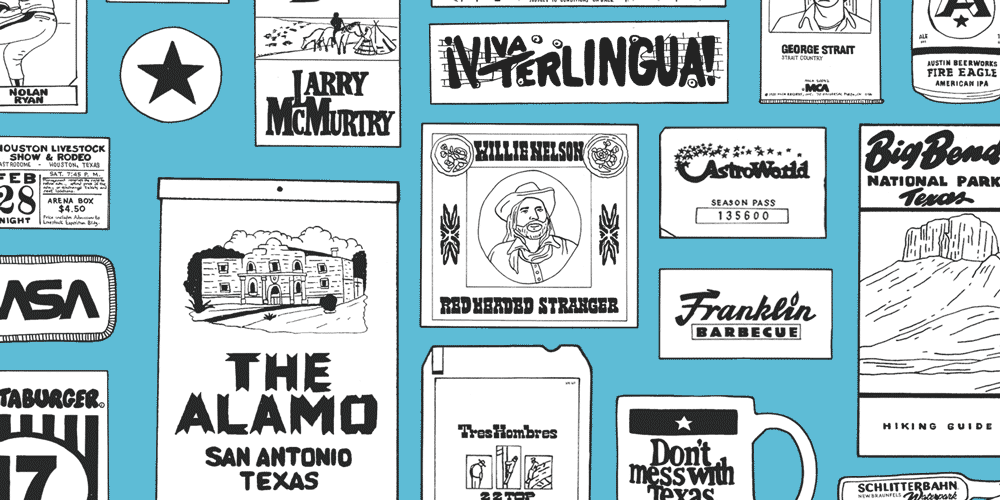
2021 Redesign or: How I Learned to Stop Art Directing and Love the Blog

I’ve been thinking a lot lately about how my friend Austin Kleon talks about “tidying up.” The idea is that tidying up your workspace is a form of productive procrastination - a way to jump-start the creative process and clear your head. Lately, I’ve been thinking about that concept and how it relates to the digital space.
My blog has always been a bit of a hot mess. On the design side, I’ve always treated it as a playground to try new things, which resulted in a lot of one-off styles and wildly inconsistent pages. I’ve also been getting bogged down with art-directed posts. From the code side of things, my skills have evolved, but I’ve never really taken the time to go back and fix old mistakes. So to give my site a bit of a reset, I decided to tidy up.
Code
When it comes to the code on my blog, my general philosophy has been, “if it looks right, who cares what it looks like behind the scenes.” Not only was I over-engineering, but I was also piling up a bunch of junk code. A lot of times, I was doing multiple overrides or duplicating what was already there. I reduced my CSS by about 30% just by sorting through everything and doing some general code tidying. Moving forward, I have a well-organized codebase that creates a clearer path for making updates and improvements.
Overthinking It
Art-directed blog posts are a trap. For instance, I have a silly little post about hair band albums that I’ve been nudging for months. I couldn’t get it to look how I wanted, and I ended up scrapping the idea. Mind you, the post took about an hour to write. I could have pushed send at that point and gone on to the next post. I asked myself: how many more posts could I have written instead of trying ten different shades of 80s-inspired pink?
I realized that if I cared about publishing in any consistent manner, I’d have to give up the obsessive art-directed posts (which is hard to do when it’s a creative outlet). So I decided to keep some flexibility to art direct; I’d just put up some constraints. Dave Rupert has a great (and practical) article about art-directed posts that made a lot of sense to me. Instead of giving myself total freedom, I’ve limited the number of decisions I can make. I can change the font, and I can change the color scheme. Knock on wood, but those are decisions I can make in a day as opposed to a month. And I can get out content quicker.
On a side note - I didn’t touch two of my favorite art-directed posts:
22 Sci-Fi Movies to Watch and Las Vegas Casino Logos.
A Consistent Format
Another problem that starts to creep up with art-directed posts is that all of your posts start to look different. That can be good or bad. Good if they all look fantastic (which is hard to do consistenly), bad if each page of your site looks dramatically different and your bounce rate creeps up.
So back to tidying up. I decided to get rid of the giant banners. I no longer have a million paragraph text styles (it’s just two now!). I’m getting away from changing the heading styles on every single post. I’m limiting my color palette, and I’m hoping to get readers to the content quicker by reducing the amount of junk at the top of the page. In short, I worked on improving the site’s overall look and feel instead of doing it on every post.
Accessibility
Here’s a fun one. When I started my blog ten years or so ago, I thought you were supposed to write alt-text like this: alt="image." So that was a problem. I’m going back and improving the alt-text where I can (but I struggle a bit with how to handle it on the long logo posts with 100+ visuals). I’m also adding an alt-text field in the front matter for all the featured images. And back to those giant post banners. It always felt icky from a color contrast perspective - I’d generally try and darken the image so they would work with white text. But that never felt right, so I got rid of them (along with the side benefit of performance improvements). I still have a long way to go, but it feels like a good starting point.
Fonts
Shocking, I know, but designers are notorious for their opinions on fonts. I’ve changed the heading font on my site a handful of times but always keep good ‘ol Franklin Gothic as my body font. But as much as I love it, I decided it was time for a change. Franklin Gothic is super versatile and can probably fit on just about any site. It’s so easy to use. But with the move away from art-directed posts and a focus on injecting some personality into the overall IA, I decided to switch over to Neue Haas Unica from Monotype. It’s very readable, and I think it has the right amount of personality moving forward.
Closing
This site will always be a work in progress. My day-to-day is more on the design side, and I rely quite a bit on my co-workers (and the internet) to make sure I’m doing things the right way. So holler with feedback!