Behind the Scenes of marksimonson .com

Paravel had the great honor of working with Mark Simonson to redesign the site for his studio. The site currently features 28 fonts, so one of my main tasks was to develop a system of specimens that showcase the beauty of his catalog. Mark is widely known as the creator of Proxima Nova, but I had an exciting opportunity to get to know the rest of his collection.
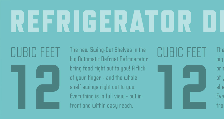
We started the exploration with one of our favorites, Refrigerator Deluxe. Trent & I rebounded it a few times until we arrived at a 1-color design that featured a common theme for the copy. I came up with a theme for each font based on the actual font name itself, or in some cases, Mark’s inspiration for the font (be sure to check out his PDF specimens for insight into his process).
Literature seemed to be a common theme as I was creating the specimens. Examples included Bookmania, Grad, Goldenbook, and Kandal.
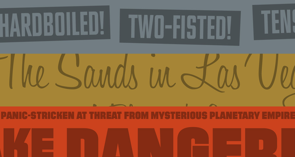
I had the most fun with Mark’s Filmotype series. It doesn’t get much better than spending a few days researching old movie posters and title sequences.
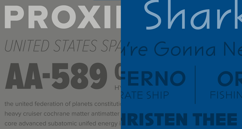
The film tie-ins didn’t stop with Filmotype. Sharktooth was based on boats in films while Proxima Nova featured fictional ships.
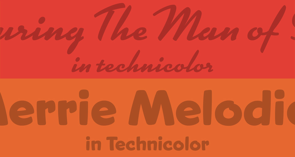
Snicker and Kinescope are playful fonts, and I tried to express that through brighter colors and cartoon-y themes.
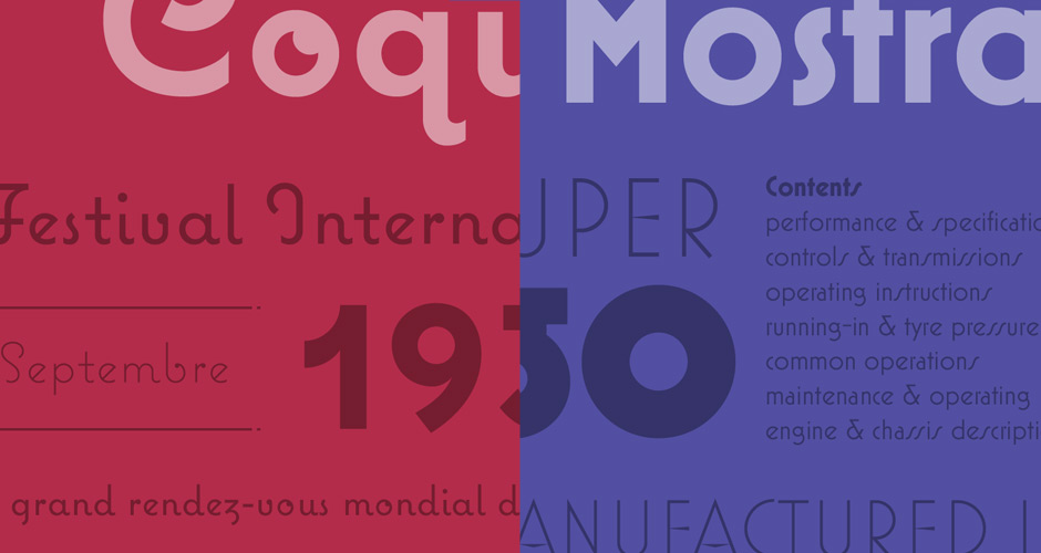
Coquette and Mostra Nuova have a bit of an international flair to them.

Lakeside and Metallophile Sp8 were two other specimens that I really enjoyed.
I don’t think I ever realized how much time and care went into the creation of his fonts. I’ve already spent several weeks playing with all of the features and don’t think I ever really scratched the surface of all the ligatures, swashes, etc in each font. They are truly a work of art.